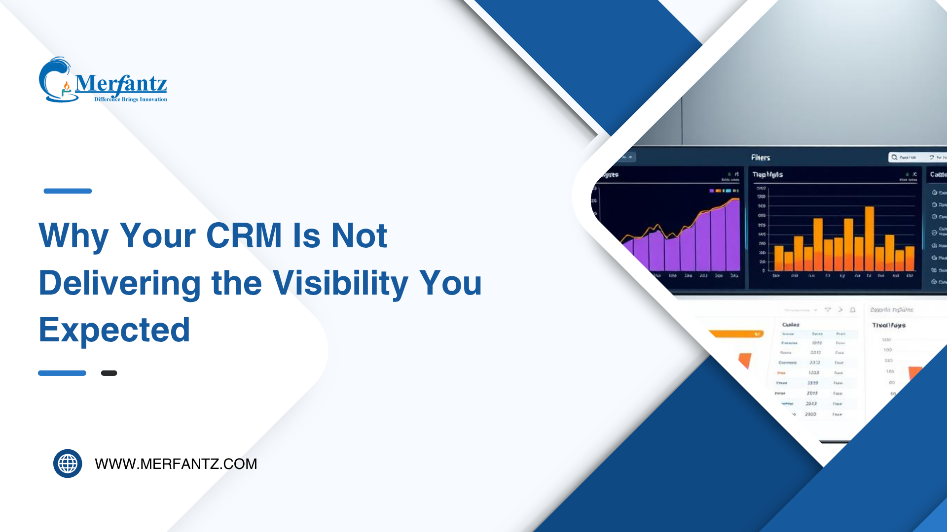
I was on a call with a sales director recently, and her frustration was palpable. She kept saying, “I know all the answers are in here, but I just can’t see them.” Her team was using the world’s most popular customer platform, yet they were still making gut-feel decisions every quarter.
This story isn’t unique. I often find that even with the #1 CRM at their fingertips, many leaders struggle to pull out the meaningful stories their numbers should tell. You expect a clear window into your pipeline, but instead, you get a scattered pile of facts and figures.

When you don’t know how to structure a proper report, you miss the powerful insights hiding in plain sight. My goal here is simple: to help you understand why your current view might be failing and how to fix it. The gap isn’t in the data you have; it’s in how you ask for it.
By mastering a few essential steps, you can transform that overwhelming stream of information into the clarity your business needs. Let’s change how your team interacts with the valuable data you’re already collecting.
Key Takeaways
- Even the most powerful business platforms can fail to provide clear visibility without the right setup.
- There’s a common gap between having customer data and actually understanding what it means for your business.
- Default or generic reports often don’t answer your team’s specific, critical questions.
- Learning to build and customize your report views is key to unlocking your system’s true potential.
- Clear, actionable information leads to confident, daily decision-making instead of guesses.
- Empowering your team with the right skills fundamentally changes how they use your tools.
- The ultimate goal is to move from feeling overwhelmed by data to being guided by it.
Understanding CRM Visibility Challenges
The real challenge begins when your data feels like a locked room instead of an open book. You have all the information, but you can’t find the key to make sense of it. This lack of clear sight is what I call a visibility gap.
Identifying Gaps in Your Current Reporting
I often see gaps appear when a standard report doesn’t show the specific fields your team needs. You might be looking at a summary of activity, but missing the crucial detail on deal stages or customer sentiment.
Many teams don’t realize their reports are built on the wrong foundation. If you’re using a tabular view when you need a summary, you’ll miss the patterns. The first step is to audit what your current views actually capture.
The Impact of Limited Data Insights on Business Decisions
When your insight is limited, your decisions become risky. You can’t spot a slowing sales trend or a shifting customer need. This means you’re always reacting, never leading.
Without the right data story, your strategy is based on guesswork. You might allocate budget to the wrong channel or miss a chance to double down on what’s working. The cost of invisible data is missed opportunity.
You must ask: do my current reports show what matters for our goals? If not, the impact is real. It slows growth and keeps your team in the dark.
Boost Your Data Insights with Salesforce reporting
What if you could transform every number in your system into a clear signal for action? Many platforms have intuitive tools waiting to be used. You can significantly boost your insights by learning to leverage them.
I recommend starting with a deep dive into your org’s information. Look at what data you collect and how it’s stored. This audit ensures users see what truly matters.
Your approach to each report makes all the difference. Customizing fields and layouts turns raw figures into a compelling story. This actionable intelligence guides strategic moves.
It is vital to remember that Salesforce offers a strong framework for analysis. This platform supports deep dives across various business models. It adapts to your unique needs.
I will guide you past simple lists. We’ll build sophisticated views that answer complex questions. These reports deliver the clarity your team craves.
With the right skills, your data becomes a dashboard for success. You’ll spot trends early and allocate resources wisely. Every new report will tell a powerful story.
Navigating the Salesforce Report Builder
Many users overlook the central hub where all their custom analysis begins. To get started, I always head over to the Reports tab. If you can’t find it, simply click the App Launcher (the nine dots icon).

The report builder interface is built for clarity. You can easily select your report type. This determines the standard or custom objects you want to analyze today.
Overview of the Report Builder Interface
This workspace feels intuitive. It allows you to add filters and define the specific fields you want to display. I find it’s the most powerful tool for creating custom views that highlight critical business data.
Key Features and Functionalities
You can structure information exactly as your team needs. A side panel shows all available fields to display or filter. This turns raw numbers into an actionable story for your next report.
Creating Your First Report in Salesforce
A practical example can make the process of creating your first view much clearer. I suggest following the lead of Lance Park, a sales rep at Ursa Major Solar. He needed to create a report to better understand his accounts and their status.
A Step-by-Step Guide to Saving and Running a Report
Start by clicking New Report and selecting your object. If you’re practicing, note that it typically takes 3-4 minutes for the system to create your Trailhead Playground environment.
Next, you will configure your view. Add the columns and filters that answer your specific questions. If your preview area looks empty, I always click the All Time link to refresh the data scope.
When you’re ready, save and run your analysis. You must give it a clear name. Adding an optional description and selecting the right folder for storage is good practice.
Finally, click Save & Run. This action lets you view the complete report. Now you can verify the accuracy of your data and see your story take shape.
Exploring Different Report Types in Salesforce
Not all views are created equal. Each serves a distinct purpose in telling your data story. The platform offers four primary report types to shape raw numbers into clear insights.
Tabular, Summary, Matrix, and Joined Reports
A Tabular report is your simplest type. Think of it like a basic spreadsheet. It lists records in rows without any grouping.
I use a Summary report when I need to group data. You can see totals, like the value of all opportunities per account.
The Matrix format groups by both rows and columns. It shows a cross-section, such as revenue by client and month.
A Joined report lets you compare different datasets side-by-side. It’s perfect for viewing cases and opportunities together.
When to Use Each Report Type
Your choice depends on the question you’re asking. Pick a Tabular report for a simple list.
Choose the Summary type when you need subtotals for categories. The Matrix report is ideal for detailed comparisons across two dimensions.
Opt for a Joined report when you must analyze two related sets of information in one view. Mastering these report types unlocks precise answers.
Enhancing Reports with Visual Elements
A picture is worth a thousand data points, and that’s exactly what a well-placed chart delivers. Visual elements transform your static numbers into a dynamic story. They help your team see patterns and insights that rows of text can hide.

Adding and Customizing Report Charts
I find that the moment you add a report chart, clarity improves. You can instantly visualize the sum of opportunity value per account. This turns complex figures into an understandable format.
You can easily add a chart to any summary or matrix report. Just click the Add Chart button in the builder interface. Once added, click the gear icon to customize it.
Change the chart type or toggle options like Show Values. This lets you highlight percentages or exact numbers. You control how the data is presented.
Charts can be toggled on and off with a single click. Use the chart icon to keep your view clean. This focus helps stakeholders grasp performance at a glance.
Visualizing your data with charts makes decision-making faster. It turns your reports into powerful communication tools. Everyone can see the story your numbers tell.
Leveraging Custom Report Types to Unlock Value
Sometimes the standard views just don’t cut it for the complex questions your business needs to answer. When your analysis requires looking across multiple layers of information, you need a more flexible tool.
Benefits of Using Custom Report Types
I recommend you create custom report types when native options can’t handle complex needs. A major benefit is the ability to report on more than two objects.
These custom report types allow you to add up to four layers of related objects. This structure provides much more flexibility in your analysis.
You can also control which columns display by default. This makes it easier for your team to get started quickly with the right data.
How to Create a Custom Report Tailored to Your Needs
Start by defining the primary object for your analysis. Ensure all related objects maintain a clear parent-child relationship in your org.
Next, use the builder to add fields via lookup from any related object. This step is where you unlock powerful, tailored insights.
Finally, you can rename and reorder sections in your custom report type. I often find this significantly improves the user experience for my colleagues.
When you create custom report structures, you build a view that answers your specific questions. This turns your platform’s data into a clear strategic asset.
Optimizing Dashboards and Analytics in Lightning
You can subscribe to key reports directly in Lightning, ensuring insights land in your inbox automatically. This feature is a gateway to building a truly dynamic view of your business. The ultimate goal is to move from static files to a live, interactive command center.
Best Practices for Building Interactive Dashboards
I believe that building interactive dashboards is the best way to provide a high-level view. Executives and sales managers need a single screen that tells the whole story. When you add a report as a component, you create a powerful visual tool.
This tool updates automatically as your underlying data changes. In Lightning Experience, you can subscribe to up to five of these key reports. You will then receive them via email on a daily, weekly, or monthly frequency.
Always remember a critical point about data security. When you subscribe to a report, recipients see whatever data the running user can access. This ensures your team always has the latest, governed insights delivered directly to them.
Using Data-Driven Strategies to Tackle CRM Challenges
The true power of your CRM emerges when you move beyond basic lists and start asking smarter questions of your data. To tackle complex visibility issues, you need a methodical approach that turns overwhelming streams into focused insights.
Incorporating Filters, Groupings, and Drill-Downs
I always start by using the Filters tab in the reports tab. This lets me apply standard filters, field filters, and cross-filters. It ensures my report shows only the relevant data I need.
You can add custom filters to your reports to narrow results further. This is essential when dealing with large datasets. It helps you isolate specific segments for analysis.
By incorporating groupings, you organize your data into logical segments. This makes it easier to spot key performance trends. You can group by region, product, or any other field.
The fields available in the side panel are powerful. I often drag them directly onto the report preview. This quickly customizes the view to show data that matters most.
Using drill-downs allows you to click into specific data points. It provides a deeper level of analysis. This technique helps you tackle complex CRM challenges with confidence when you view report details.
Conclusion
Ultimately, the value of your business platform is unlocked by the questions you ask. I believe the most valuable skill you can develop is mastering how to build the right reports.
By understanding different report types and custom structures, you unlock your organization’s full data potential. This turns your platform into a source of clear, actionable intelligence.
Practice these skills in a safe sandbox environment. Consistent data analysis is the true key to informed decisions that drive growth.
Start today. Create your first custom report and begin transforming your visibility. The path to confident leadership is guided by your data.
FAQ
What’s the difference between a summary report and a matrix report?
How do I make my dashboards more interactive in Lightning Experience?
When should I create a custom report type?
Can I add a visual chart to any report I build?
Is the report builder difficult for a beginner to learn?
Author Bio

Co-Founder & CMO at Merfantz Technologies Pvt Ltd | Marketing Manager for FieldAx Field Service Software | Salesforce All-Star Ranger and Community Contributor | Salesforce Content Creation for Knowledge Sharing